
Peabody
a mobile-first SaaS storefront for Prismatext
Goals
Peabody was created to replace Prismatext's legacy Shopify storefront, which had become a bottleneck for growth. While Shopify served its purpose early on, it offered little visibility into checkout workflows and couldn't accommodate our evolving SaaS business model.
Our goals were threefold:
- Improve conversion rates through more flexible product presentation and rotating, seasonal collections.
- Boost performance—our heavily customized Shopify site routinely scored around 30% on Google Lighthouse, creating friction and slow load times for users.
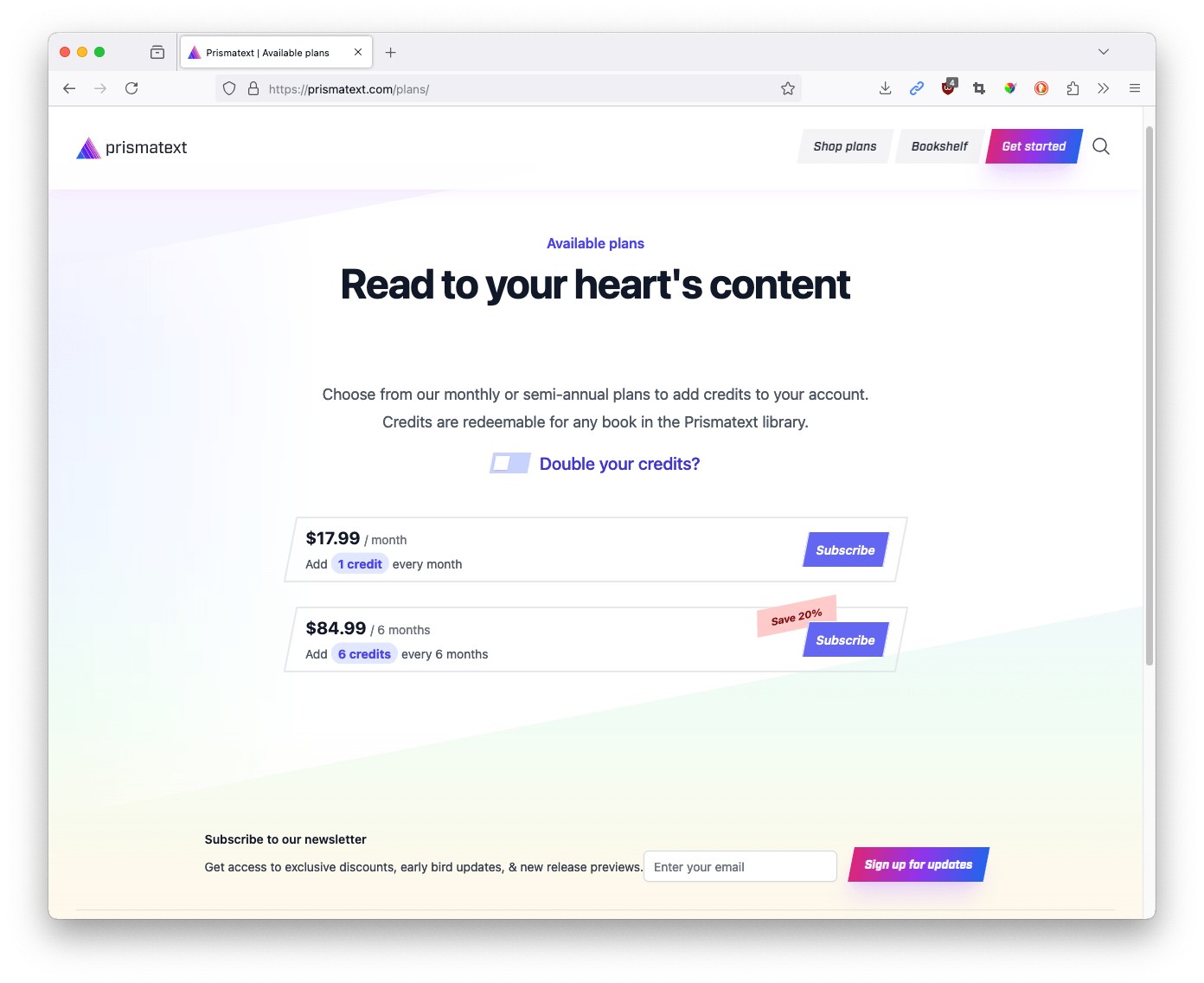
- Introduce a subscription model, complete with monthly credits that users could redeem for books both on the web and in the mobile app.

Less is more. Here, we rely heavily on the typed animation of the highlighted words to alternate between languages.
Insights
We began by auditing analytics and customer behavior from our Shopify storefront. One major insight was how the absence of subscriptions limited both our customer engagement and our financial forecasting. Users had no recurring incentive to return, and each purchase required a new decision—introducing friction and unpredictability to our revenue model.
At the same time, feedback from our mobile app users made clear that we needed a better bridge between the storefront and the app. Because app stores take a 30% commission on in-app purchases, we wanted a system where users could buy credits on the web and seamlessly redeem them in the app. This design choice not only protected our margins but also gave users a consistent, unified purchasing experience.
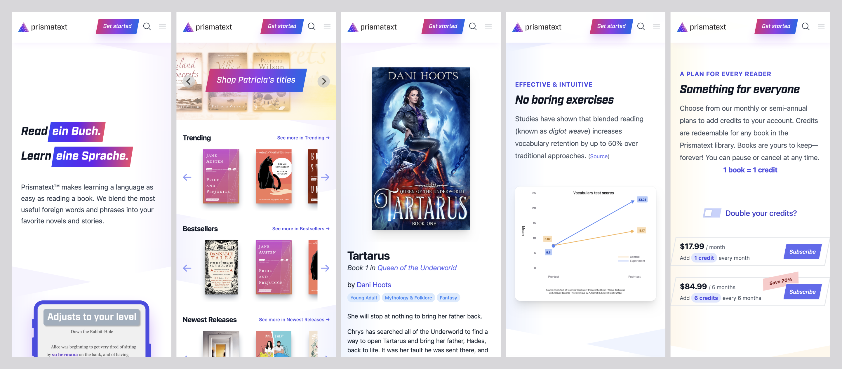
A mobile-first approach to the storefront ensured that the most important content was front-and-center, regardless of device.
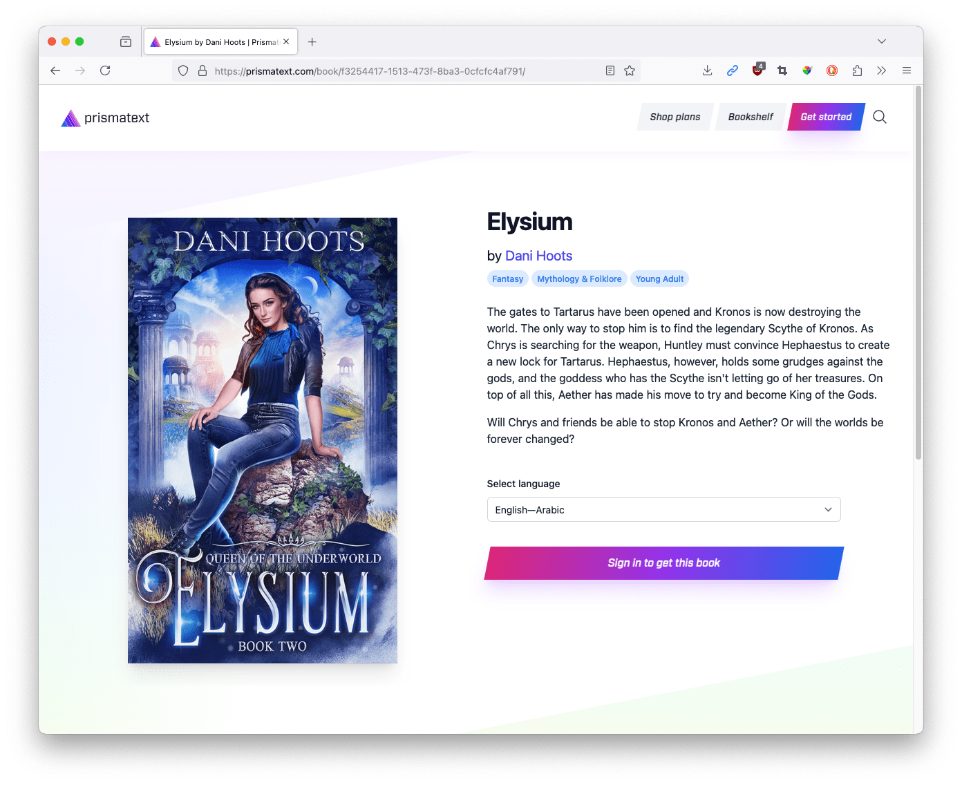
Each book detail page has rich information about the book, the available language variants, and similar titles.
One of my favorite visual cues was the skewed buttons/containers peppered throughout the interface

We constantly referred back to the phrase 'get out of the way' when designing the UI, as we didn't want to present any obstructions to the user browsing for books.
Constraints
The transition came with a number of logistical and technical challenges. We had to:
- Migrate legacy customers while preserving their purchase histories and ensuring past books remained accessible through the new storefront.
- Maintain seamless communication between Peabody (the web storefront) and Rocky (the mobile app) so that newly redeemed books appeared instantly in the user's library.
- Rebuild under tight timelines while the SaaS rollout was in motion, ensuring minimal business interruption.
Concepts
Our design principles centered on clarity, speed, and consistency:
- A credit-based economy underpinned both the storefront and the app, with a clear redemption flow and transparent account balance.
- Stripe-based checkout simplified the purchasing experience and allowed us to completely decouple payment logic from book access and credit management.
- Mobile-first design ensured responsiveness and usability across devices while visually aligning the storefront with the mobile app through shared color systems, iconography, and type styles.
Tradeoffs
The biggest tradeoff was scope. While we had initially envisioned a web-based reader embedded within the user account area, timeline pressures required us to postpone it in favor of launching a stable, high-performance core experience.
We also chose not to introduce advanced personalization features at launch, focusing instead on reliability, speed, and subscription flow polish. These tradeoffs allowed the project to hit critical deadlines while maintaining a foundation that could easily evolve in later versions.
Impact
The impact of Peabody was immediate and measurable:
- Performance skyrocketed—our Google Lighthouse scores jumped from the 30% range to as high as 90%, dramatically improving load times and engagement.
- UX friction dropped—with Stripe's simplified checkout and integrated credit redemption, users could go from browsing to reading in seconds.
- Recurring revenue stabilized—the introduction of subscriptions and credit tracking enabled us to monitor MRR and scale sustainably.