Rocky
the Prismatext mobile app for iOS & Android
Goals
When Prismatext first began, our books were delivered the old-fashioned way—via email. Customers would receive an EPUB or MOBI file, then manually sideload it onto their preferred e-reader. It worked, technically, but the experience was clunky and far from the seamless, language-learning journey we envisioned. The decision to build a mobile app wasn't just about convenience; it was an opportunity to fundamentally reimagine the Prismatext experience.
With a dedicated app, we could add features traditional e-readers simply couldn't offer—like inline audio pronunciation and variable translation density. It would also let us push updates and corrections instantly, rather than requiring users to re-upload files. Most importantly, it would give us the ability to understand how our readers were actually engaging with their books and provide a foundation for protecting our own intellectual property.
From a product standpoint, the goals were clear: reduce time-to-deployment by 90%, create a truly seamless bridge between the Prismatext storefront and the reading experience, and build the technical means to correlate in-app activity (WAU/MAU) with storefront data.
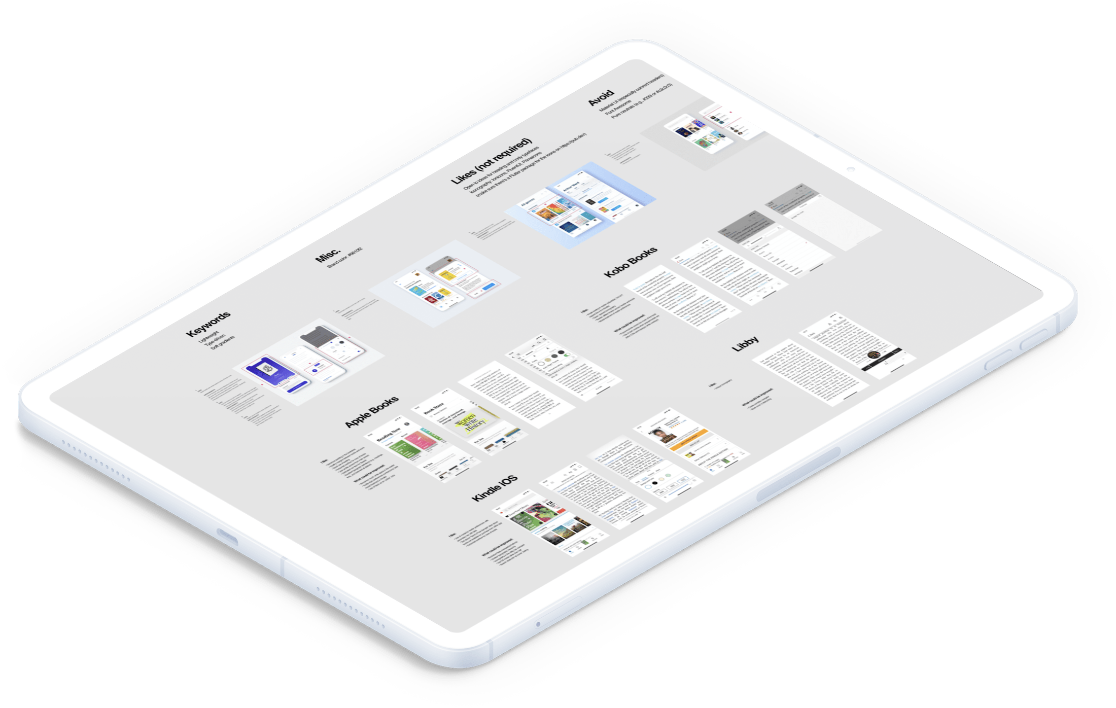
A design teardown of existing e-reader applications, highlighting their strengths and weaknesses
Insights
Before jumping into design, I wanted a clear sense of where we could differentiate meaningfully—and where it was smarter to adopt well-tested patterns. I began by performing teardowns on the major e-reader apps already in the market. Despite their brand and visual differences, many of them used surprisingly similar patterns for navigation, highlighting, and page transitions. That consistency was telling: it meant their teams had likely tested and converged on similar usability conclusions. Rather than reinventing every wheel, we took this as validation to adopt those proven conventions, freeing our bandwidth for innovation in the areas that mattered most—like bilingual reading interactions.
In parallel, we surveyed our early customers to understand their comfort level with mobile-based learning tools. The results were reassuring. The majority were already using mobile apps for language learning and felt confident about integrating another into their routine. That insight reinforced our hypothesis that a mobile app wouldn't just streamline the product—it would make it more familiar and accessible to our audience.
A quick assortment of high-level concepts for an early iteration of the Prismatext mobile app
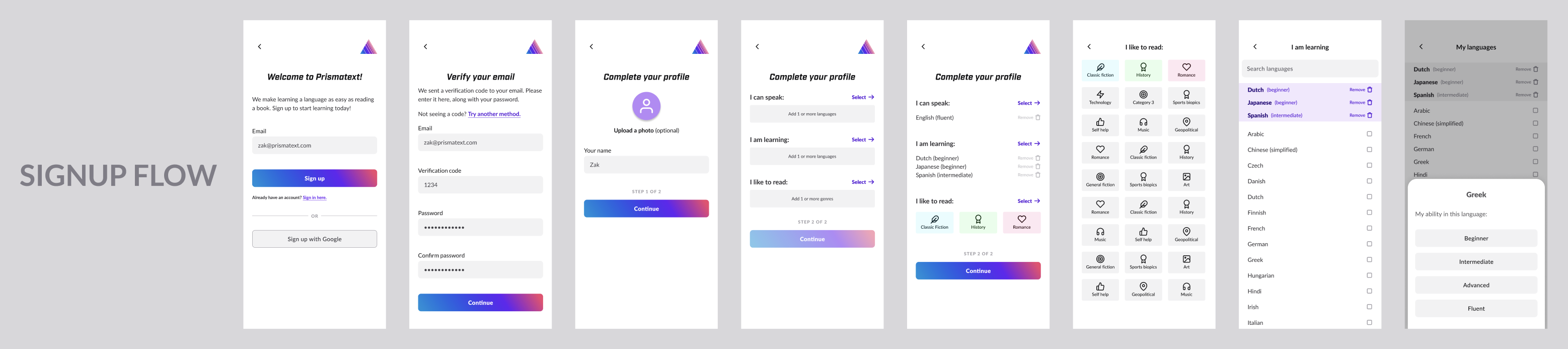
An early onboarding experience for the Prismatext mobile app. Our goal here was to capture user abilities and interest to help personalize their experience right from the start (continued below).
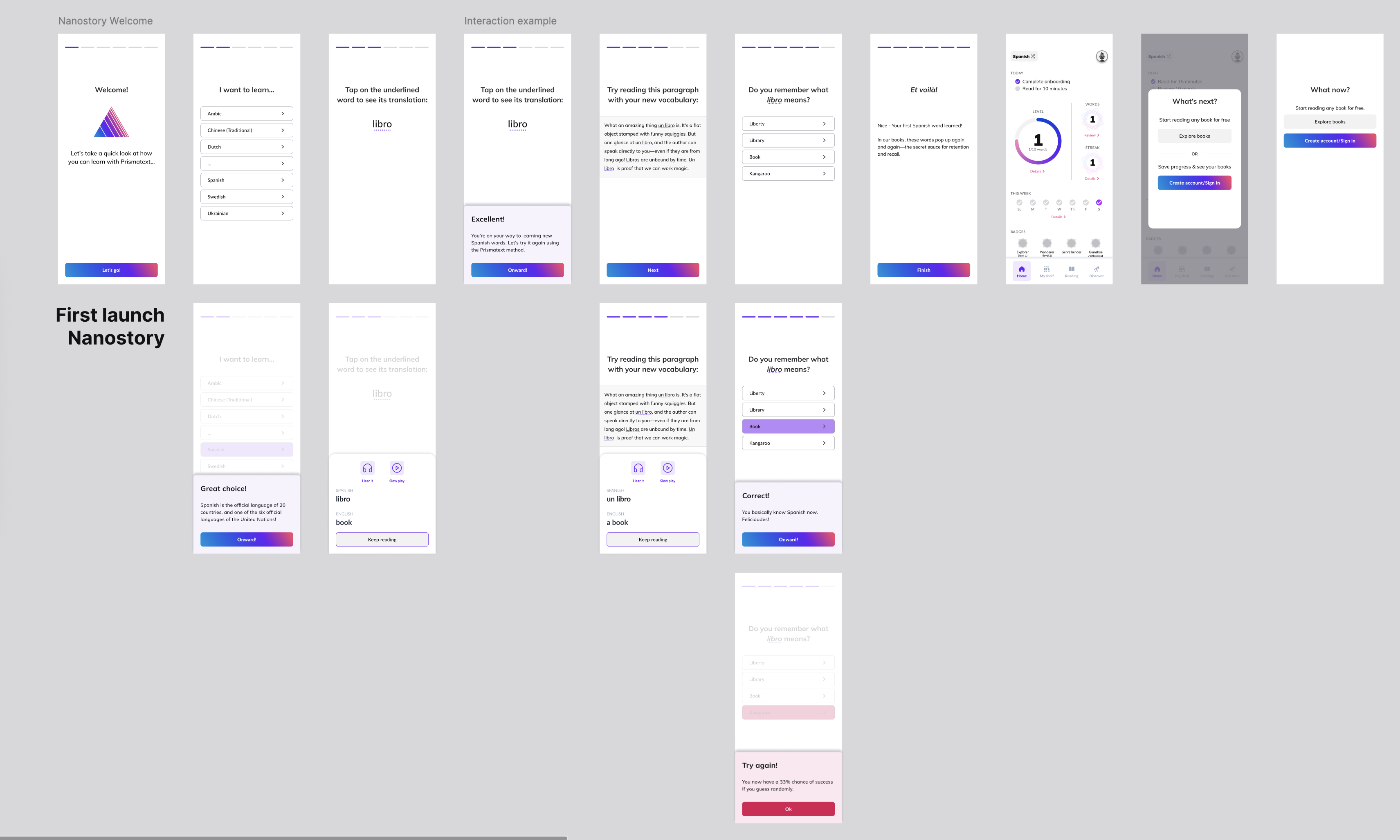
A challenge we faced with the previous onboarding experience was how best to deliver the 'Aha!' moment to new users. We arrived at a solution where they would first be introduced to a new word in their target language, then immediately see it in context within a small passage where it was used.
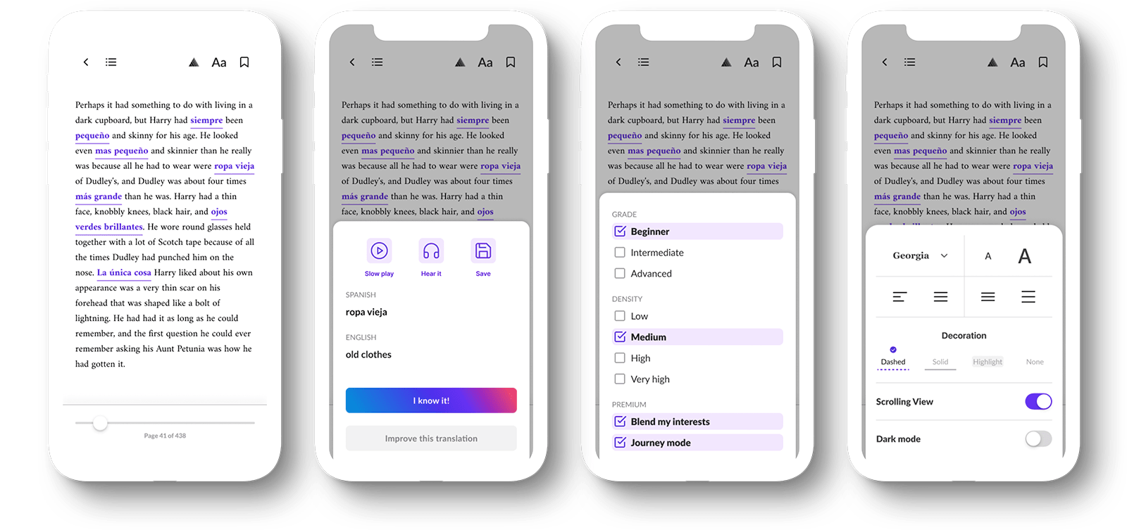
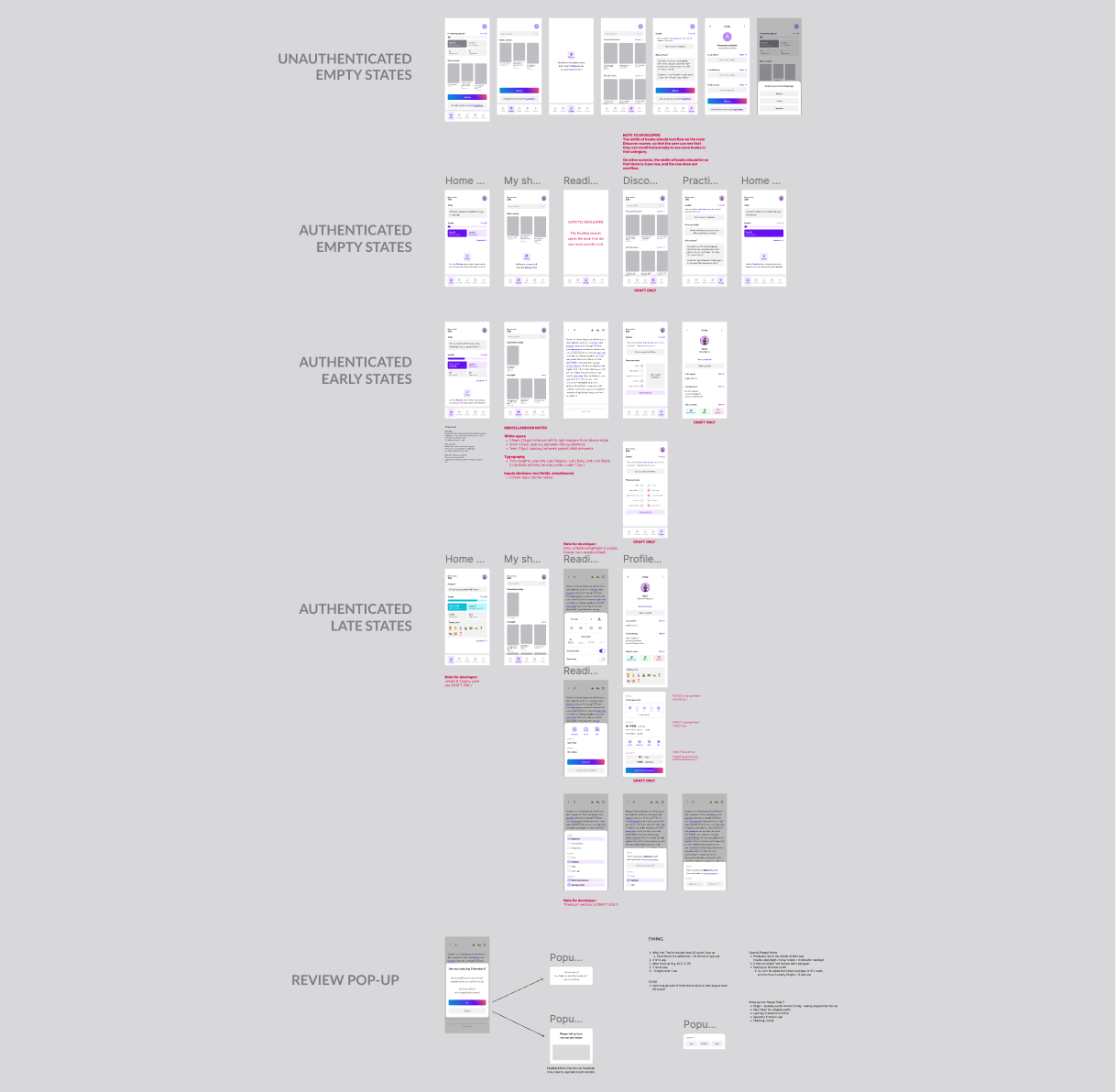
A late prototype demonstrating pop-up functionality in the reader. Users can view translations, hear audio pronunciation, change the density of the foreign words, and adjust the reader settings without having to leave their place in the book.
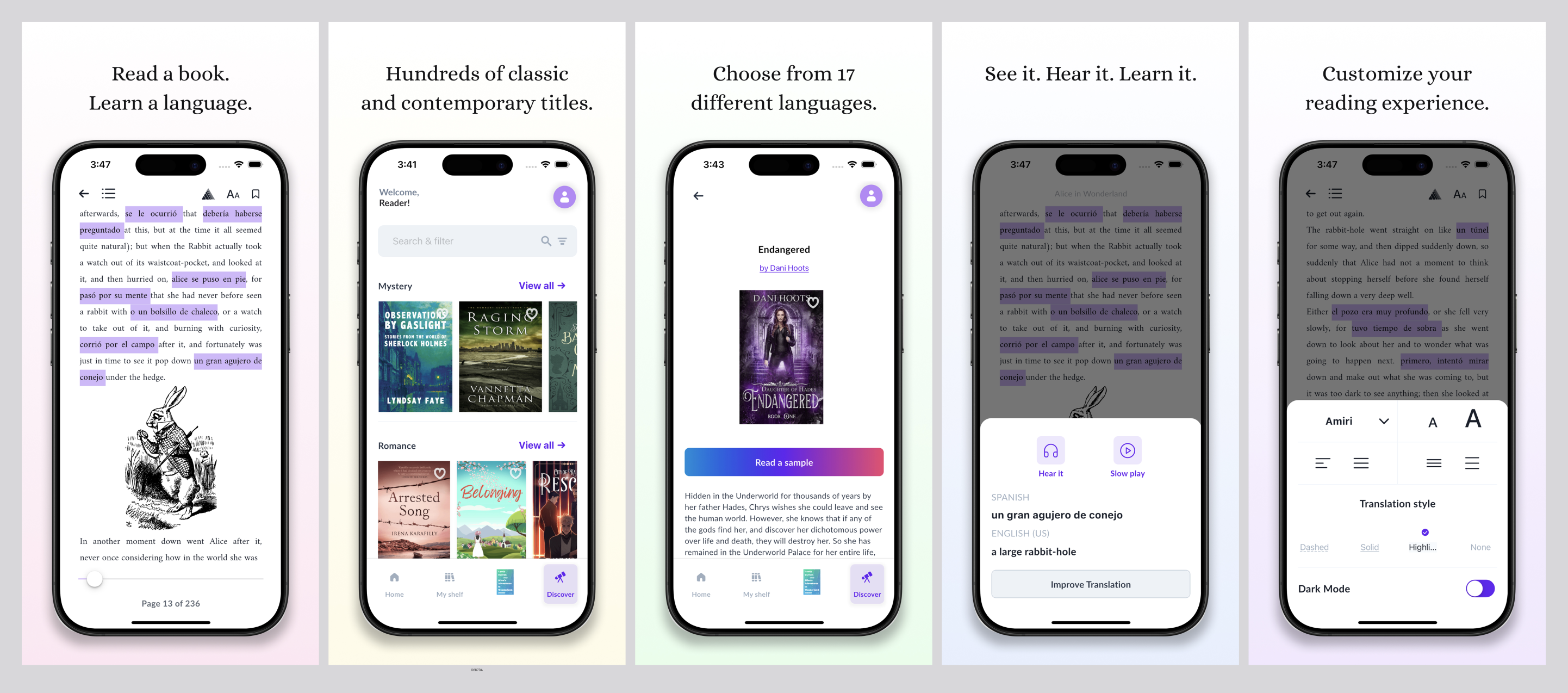
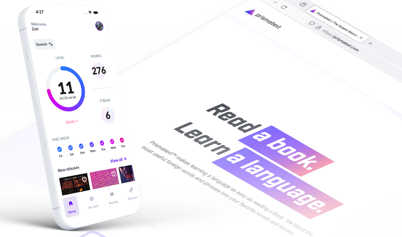
A high-fidelity overview of each of the major sections of the mobile app.
Constraints
Our biggest challenge wasn't technical—it was logistical. As a small team, we were racing against time and market limits. The existing customer experience, based on manual file handling, was nearing the point of diminishing returns. We needed to modernize fast, but our development bandwidth was tight.
This meant that every design decision had to be practical, every feature scoped carefully. I worked closely with our engineers to ensure that the app's design system and component library could scale efficiently. Where possible, we reused visual and interaction paradigms from our web storefront to shorten implementation time and maintain brand consistency.
Concepts
With the groundwork in place, my first deliverable was a detailed requirements document. It outlined what "Rocky," our mobile app, would do and how it would interact with "Bullwinkle," the backend stack responsible for generating blended-language books. This specification became the backbone of our collaboration, ensuring that product, design, and engineering were speaking the same language.
Afterward, I created wireframes that visualized different user flows—from signing in, to browsing a book, to adjusting translation density. These early prototypes gave us a chance to validate the reading experience quickly and identify where new features like inline pronunciation could naturally fit. Once the key workflows were mapped, I shifted focus to the visual system, building out robust, reusable components and documenting design decisions thoroughly for incoming designers.
Tradeoffs
Every product build involves difficult prioritization, and this one was no exception. One of our early ambitions was to let users fine-tune not just how much translation appeared in a text, but which words were prioritized for translation. It was a powerful idea, but implementing it would have required additional backend complexity and a longer development timeline. With the clock ticking, we chose to focus on delivering a reliable, elegant reading experience first—and save the more experimental features for a later release.
That choice paid off. It kept our scope manageable and allowed the team to deliver a polished app on time without compromising stability. Still, it was a good reminder that building a product is as much about what you don't ship as what you do.
Impact
The results were immediate. User onboarding and engagement rates jumped dramatically, as readers could now download the app and start reading in seconds rather than juggling file transfers. The direct connection between storefront and reading experience allowed us to gather richer feedback, identify pain points, and iterate faster than ever before.
On the business side, the app demonstrated to our publishing partners that Prismatext could handle their intellectual property with care. The controlled ecosystem provided the safeguards they needed to feel comfortable sharing licensed content, which in turn opened doors to new partnerships and catalog expansions.
Perhaps most meaningfully, the app transformed the way we worked as a team. As a cofounder with a product design background, I had to consciously step back from pixel-level perfection and focus on the broader vision—trusting the team to execute, and learning to communicate that vision clearly and confidently.
The Prismatext app wasn't just a technical upgrade; it marked the moment we evolved from a clever idea into a scalable platform—one capable of growing alongside our users, our partners, and our own ambitions.