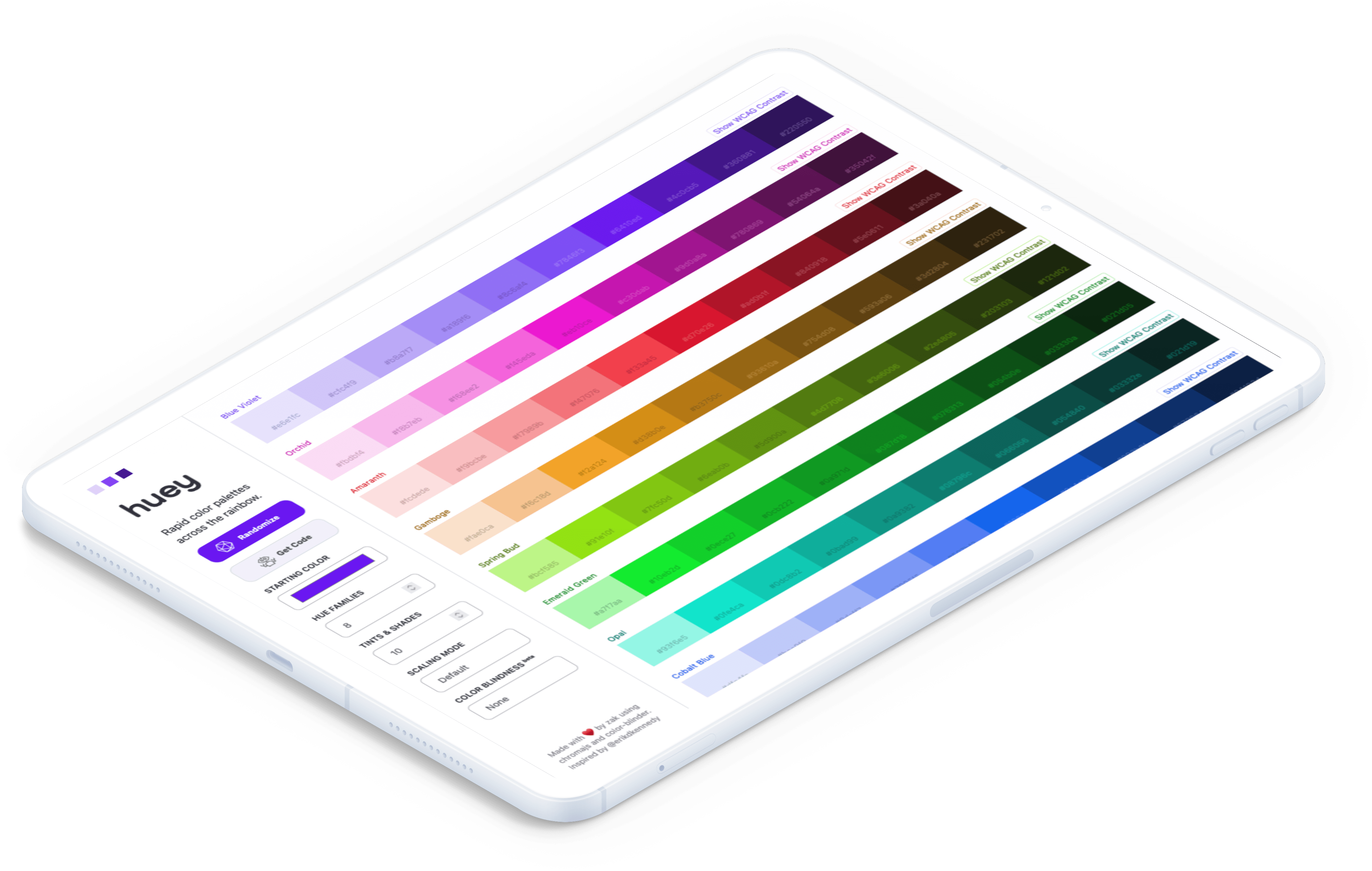
Huey
a color palette generator used for whitelabel solutions
Goals
Turntide's Building Management System (BMS) was built to integrate seamlessly with any client's branding, so whitelabeling wasn't a nice-to-have—it was essential. Each client needed a full range of brand-specific colors, complete with tints, shades, and accessibility-compliant variations. But manually building these palettes was slow, repetitive work that could easily eat up hours or even days.
That's where Huey came in. I designed it as an internal tool to help our teams generate color palettes that aligned with both brand guidelines and accessibility standards, dramatically reducing the time it took to create and verify compliant color systems.
One of Huey's most important design goals was future compatibility. The World Wide Web Consortium (W3C) was preparing to release new accessibility standards under WCAG 3.0, with significant changes to how color contrast should be calculated. I wanted Huey to work seamlessly across both the existing 2.2 guidelines and the forthcoming 3.0 specifications, ensuring our design system would remain compliant as the industry evolved.
Though the initial audience was internal—Turntide's design and engineering teams—Huey's potential was too valuable to keep in-house. I eventually open-sourced it at huey.design, inviting other designers and developers to use it, stress-test it, and help improve it.
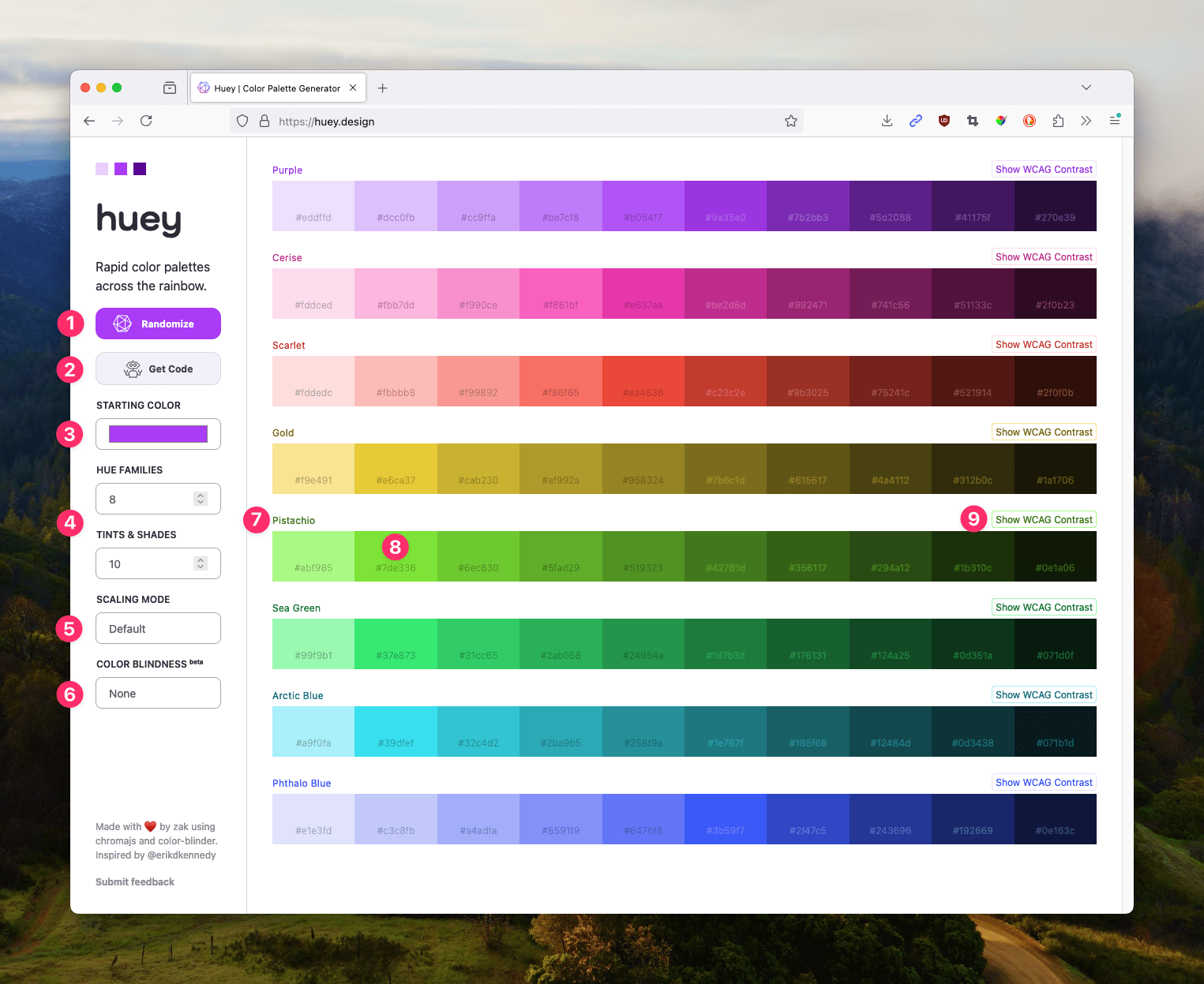
- A random color re-paints Huey each time it loads
- Huey exports instantly to PostCSS, SCSS, and Tailwind
- Set brand colors easily
- Customize palettes across all dimensions
- Color scales can be calculated with different color modes
- Check for color blindness with the simulator
- Copy the hex for a hue with a click
- Copy an individual color's hex by clicking its cell
- Each hue has its own WCAG contrast chart
Insights
Before writing a line of code, I spent time evaluating other color-generation tools to understand their limitations. What I found was that most existing palette generators worked in only one direction. They could either generate tints and shades of a single hue, or create a color scheme based on hue relationships—complementary, analogous, triadic, and so on. But none of them effectively handled both dimensions at once.
In practice, that meant designers often had to bounce between multiple tools just to create, validate, and test a single palette. I wanted Huey to eliminate that friction by allowing users to explore hue relationships and tonal depth in one cohesive space—while also surfacing meaningful data about how each tint and shade interacted with its neighbors.
This insight became the foundation for Huey's design philosophy: the tool shouldn't just generate color—it should explain it. That distinction guided nearly every design decision that followed.
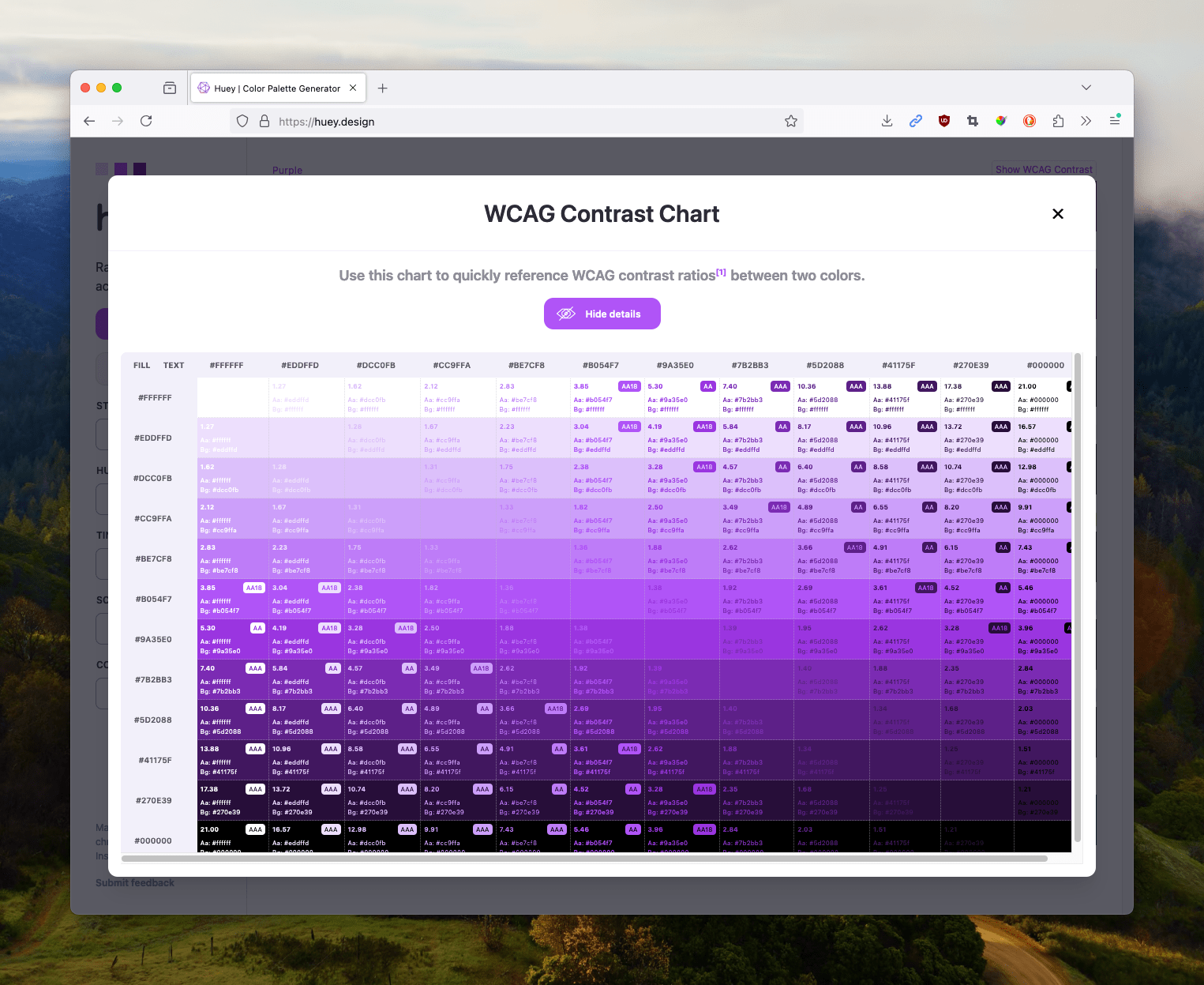
The contrast chart shows useful information for every color pair in the hue family.
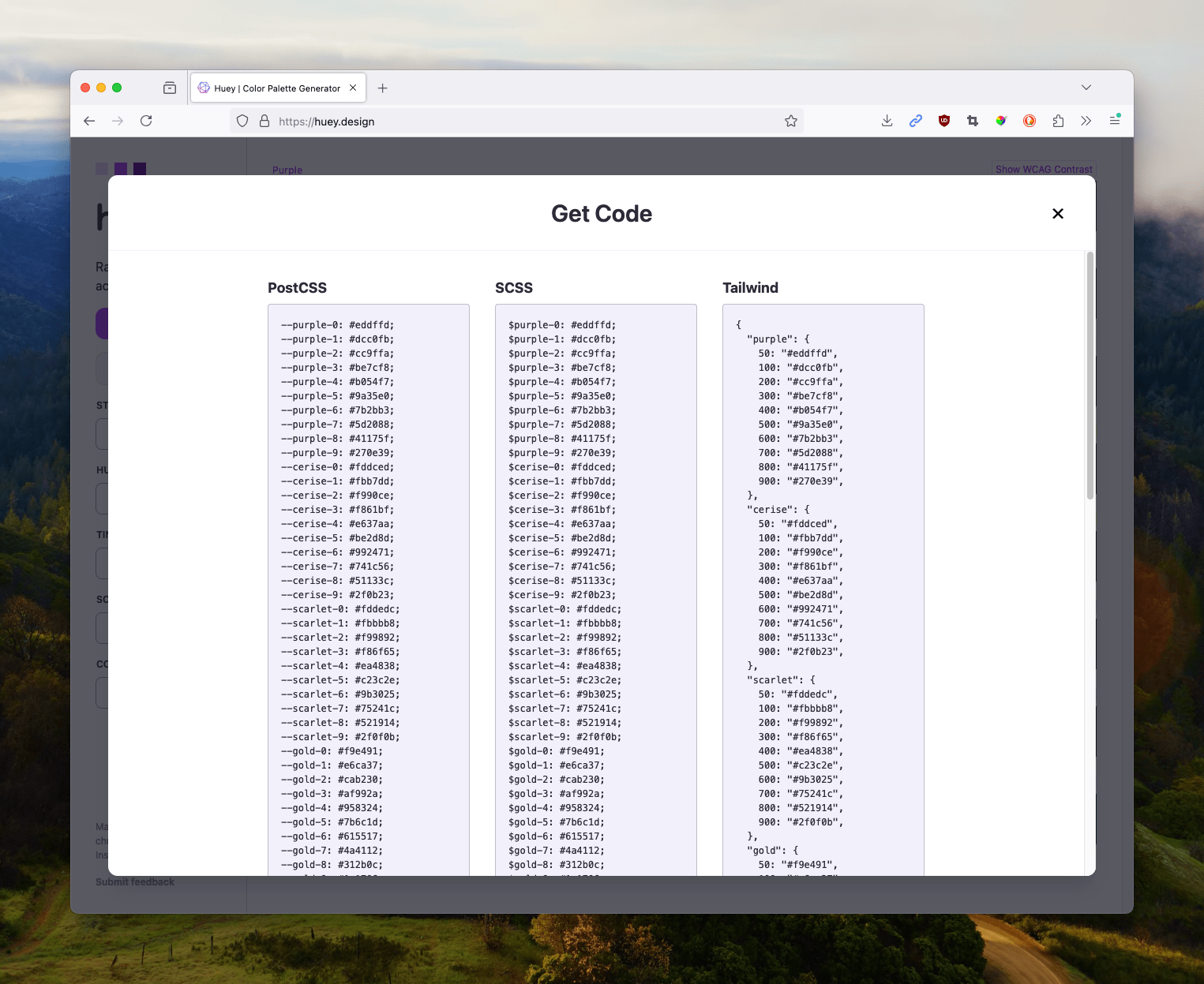
Huey can export to PostCSS, SCSS, and Tailwind in an instant.
Constraints
Huey's biggest challenge wasn't about UI polish or performance—it was about precision. Accurately calculating color contrast requires reliable color conversion methods and careful handling of how luminance is perceived across different hues. Even small discrepancies could mean the difference between passing and failing WCAG compliance.
Because the WCAG 3.0 contrast formula was still in flux at the time, I had to build the system in a way that could accommodate updates without requiring a complete rewrite. That meant modularizing the color integrity calculations and ensuring that each algorithm could be swapped out or adjusted as new guidance emerged.
On top of that, I was teaching myself Vue.js as I built the tool. Although I'd spent years working with React and Angular, Vue was relatively new territory. The challenge was balancing the need to learn a new framework with the urgency of getting a functional prototype in front of users.
Concepts
Huey started as a lightweight internal prototype—a sandbox where designers could input brand colors and instantly see generated palettes, complete with tint and shade variations. The tool dynamically calculated accessibility contrast ratios for each color pair, labeling which combinations met WCAG 2.2 and 3.0 standards.
I used Vue.js for its straightforward syntax and component-based architecture, which made it easy to separate complex calculations from the UI. As the prototype evolved, I added support for two-dimensional palette generation, allowing users to explore tonal and relational color variations in a single grid.
The interface focused on clarity and exploration. Designers could tweak colors on the fly, compare accessibility results in real time, and even share or re-create palettes instantly using URL-based state storage. This last feature turned out to be a subtle but powerful addition—it meant a generated palette could be bookmarked, documented, or passed between teams with zero setup overhead.
Tradeoffs
One of the most significant tradeoffs I made was deciding not to optimize for mobile devices. While accessibility is generally a design priority for me, in this case I chose to prioritize clarity over reach. A smaller screen simply couldn't display the full scope of the data—the relationships between hues, tints, shades, and contrast values—without losing important context.
By focusing exclusively on desktop, I could present information densely but legibly, preserving the nuance that made Huey useful in the first place. It was a conscious decision to design for depth rather than breadth, even if it meant sacrificing a segment of potential users.
Impact
Huey quickly became a staple tool within Turntide. What once took designers days could now be accomplished in seconds. The automatic generation and validation of compliant palettes drastically accelerated our whitelabeling workflow, ensuring that each client's visual identity was both consistent and accessible.
Beyond internal adoption, Huey found an enthusiastic audience elsewhere. I shared it with peers in the design community—including a designer at a major fintech company—who then introduced it to her team. It also gained traction online, especially among frontend and design enthusiasts in communities like r/tailwindcss and r/frontend.
By open-sourcing Huey, I transformed it from a company-specific utility into a shared resource for the broader design community. It's gratifying to know that a project originally built to solve one organization's problem is now helping others improve their accessibility and design efficiency as well.
For me personally, Huey represents a kind of creative closure. Back in 2013, I wrote my first dynamic color scale in Sass—a scrappy but incomplete solution that couldn't handle modern accessibility or multidimensional color systems. Huey closed that loop, combining a decade of experience with a deep curiosity for how design systems evolve. It's still one of my favorite projects—equal parts technical challenge, learning opportunity, and love letter to the craft of color itself.